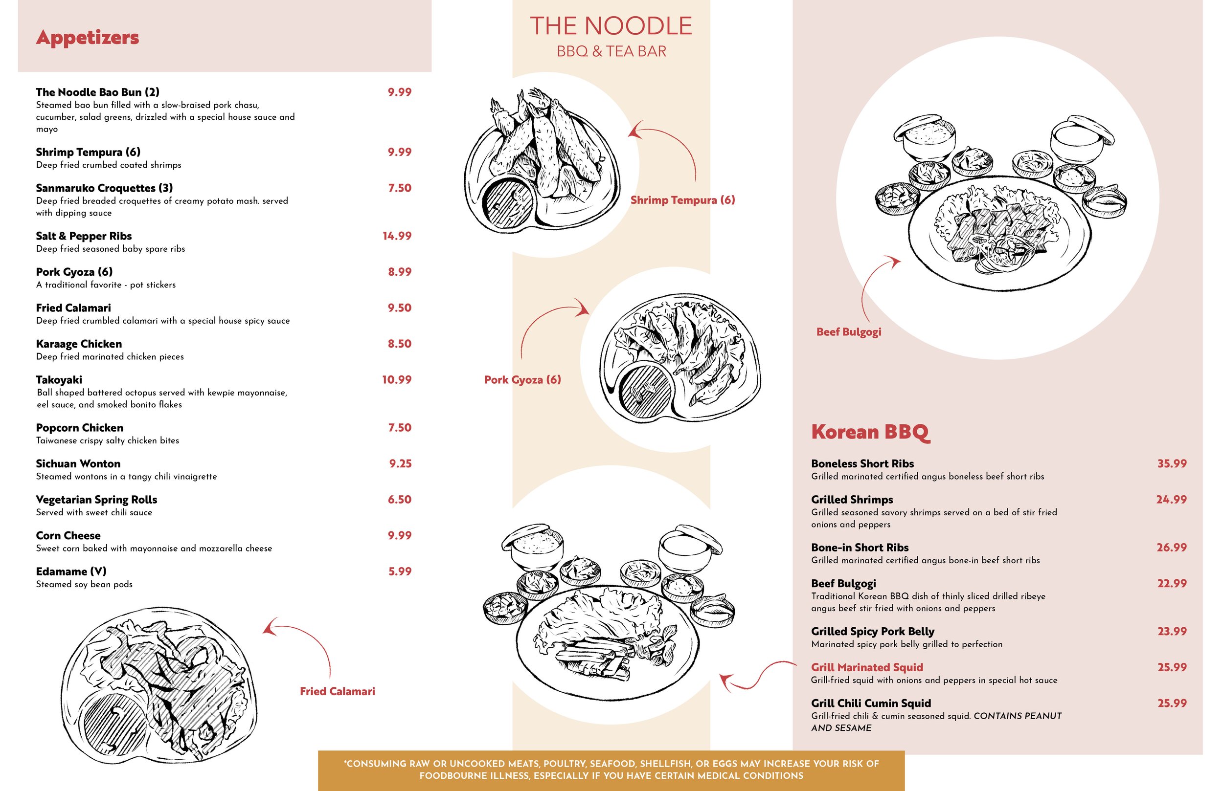
For this case study, we were tasked with redesigning a restaurant menu to improve customer satisfaction and enhance legibility. My goal was to highlight my illustration skills while prioritizing the clarity of essential information. I also aimed to capture the restaurant’s modern yet minimalist aesthetic, creating a menu that feels both welcoming and visually engaging for customers.

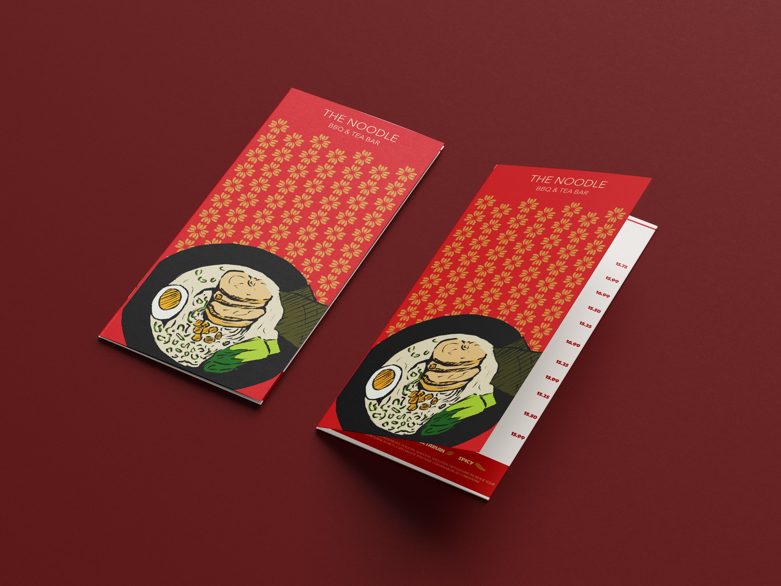
In my design, I focused on the layout and how customers would naturally navigate the menu. To create a more engaging experience, I chose a tri-fold flyer format that feels both functional and visually appealing. I also selected a bold typeface to create contrast with the delicate illustrations and item descriptions. The color palette draws inspiration from traditional Asian restaurant aesthetics, incorporating shades of red, cream, gold, and a touch of blue.