
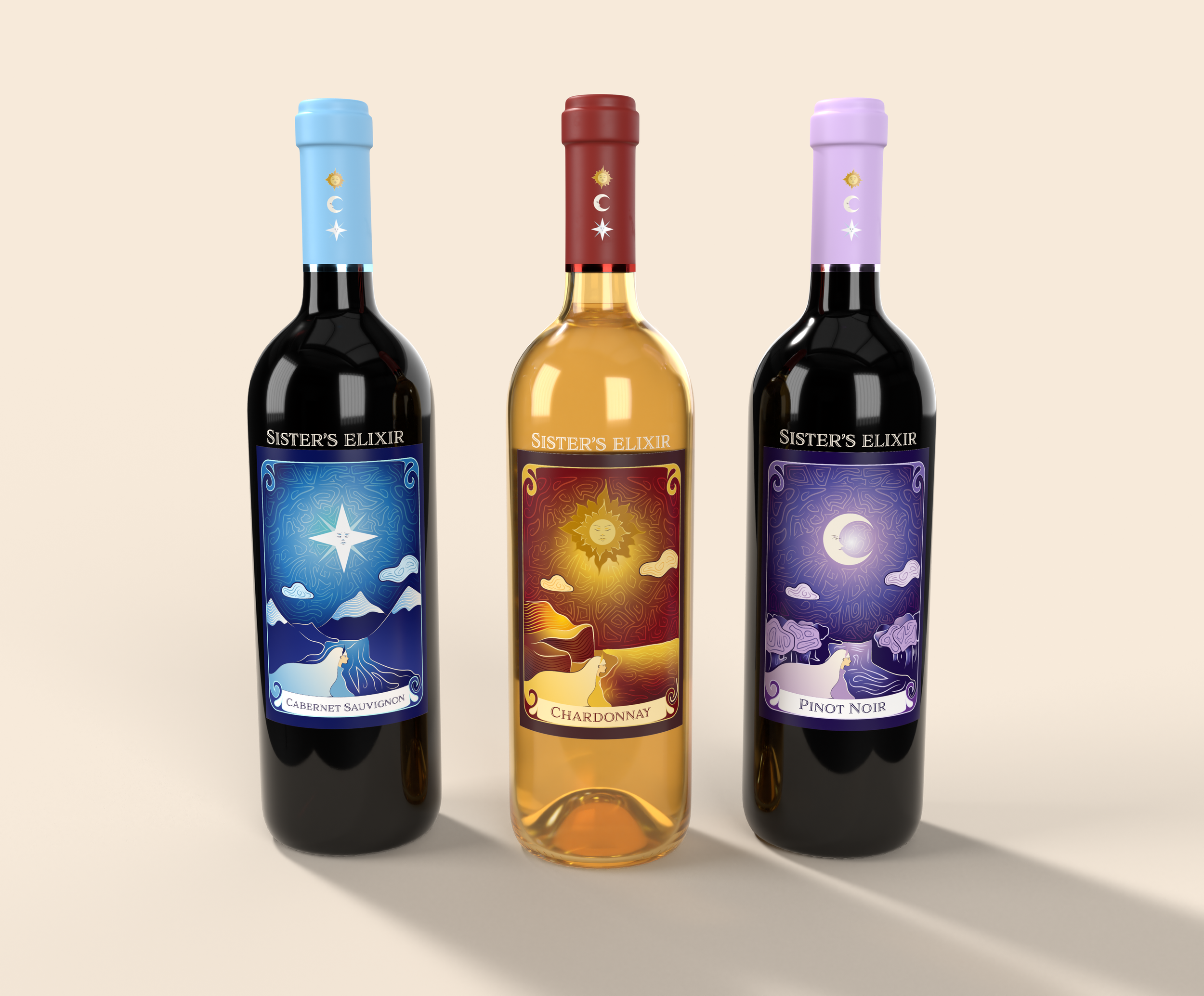
For this case study, we were tasked with creating a series of wine bottles along with three labels for chocolate and one additional item. For my brand, I wanted to incorporate my style of fantasy and mystical elements. My company is called “Sister’s Elixir”, focusing on the three sisters represented on each bottle. The Sun, Moon, and Star. Each bottle portrays a different scenery, allowing for different experiences.

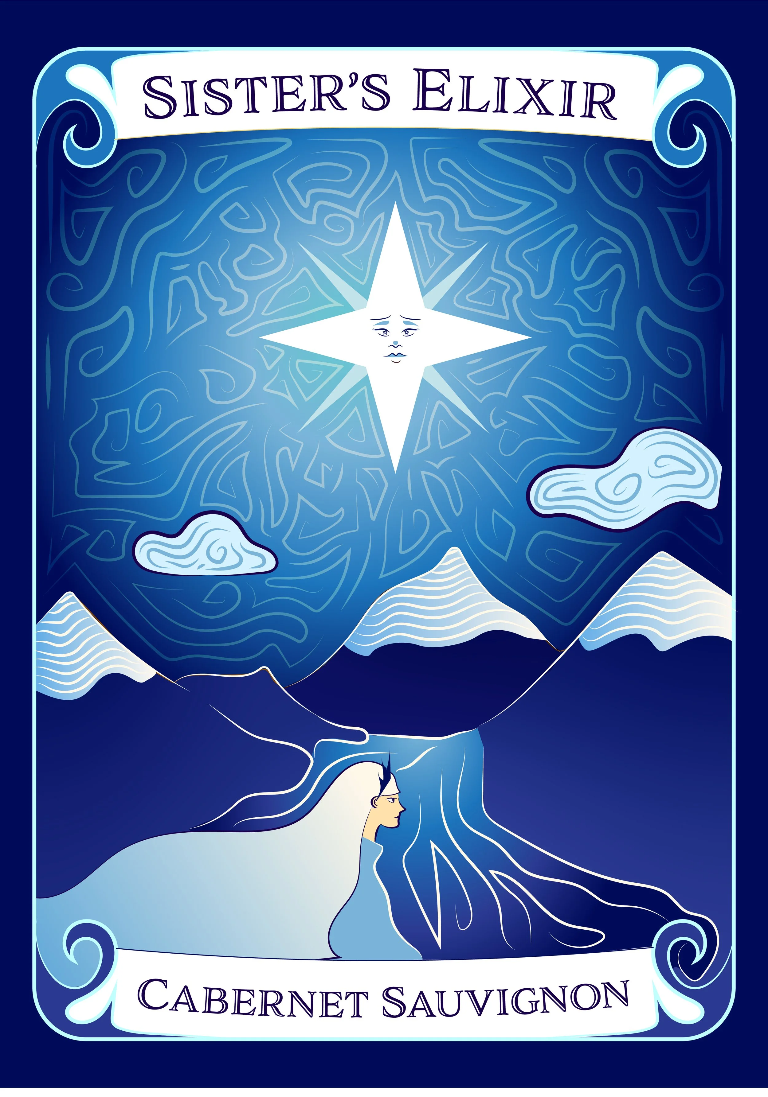
For my design, I wanted to incorporate two ideas I had and mesh them together. I wanted to portray the three different environments while also having them be a little similar so the user knows it is from the same brand. The idea was for the labels to look like tarot cards and have the sisters be representative of the reading they mean. I believe my use of color executed this thought, allowing them to be distinct and familiar but also separate to their own flavors
Concept idea


Progress


Rough draft #1
At first, all the environments of the labels were the same, the only difference was the color palette and element in the sky. I got feedback suggesting I make each one unique and not repetitive.


Rough draft #2
Each background has been changed and made unique to the sister representing it. This idea showcases the story better and we can get a sense that they are all in different parts of the world but are connected by the sky.


