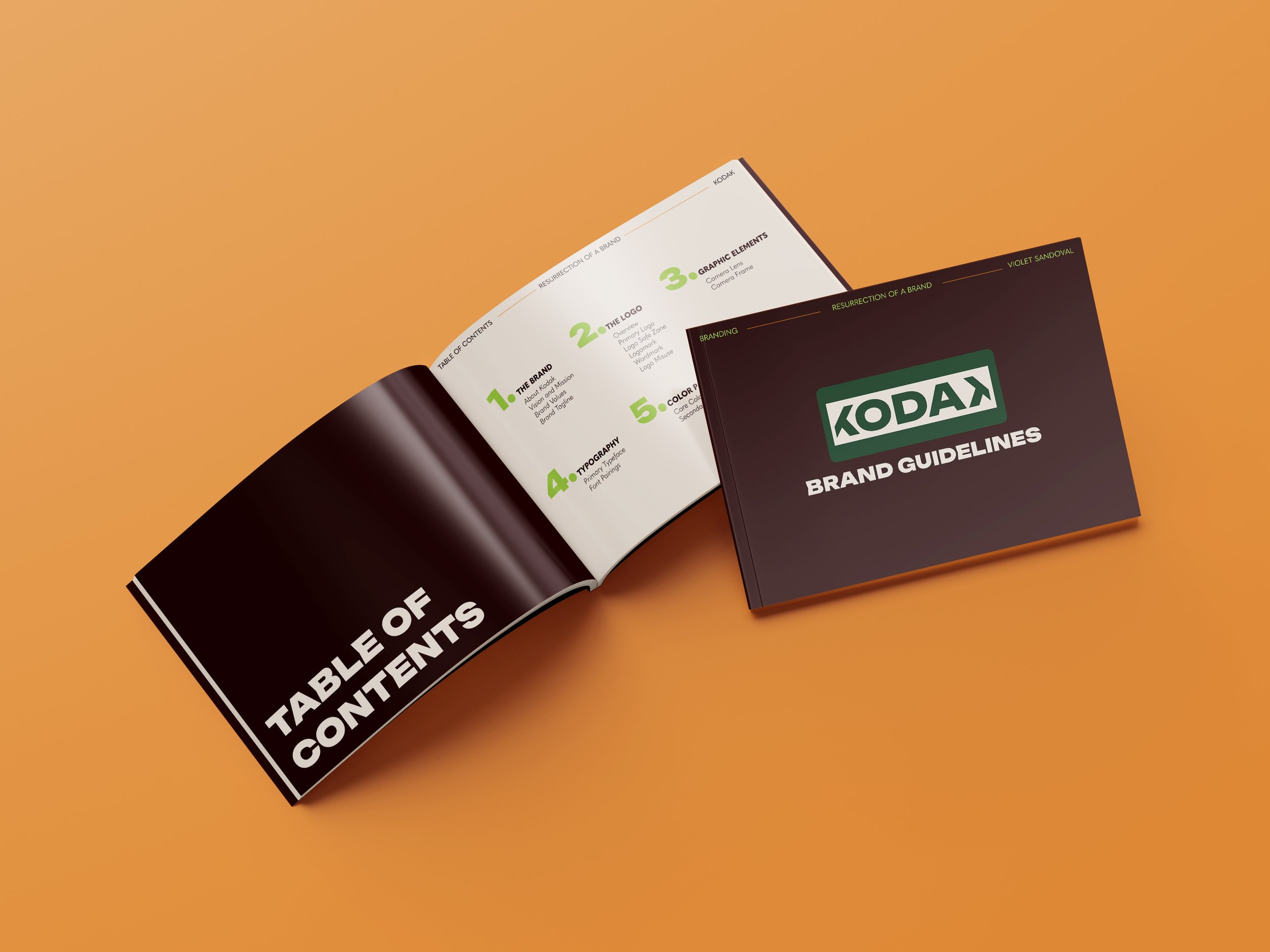
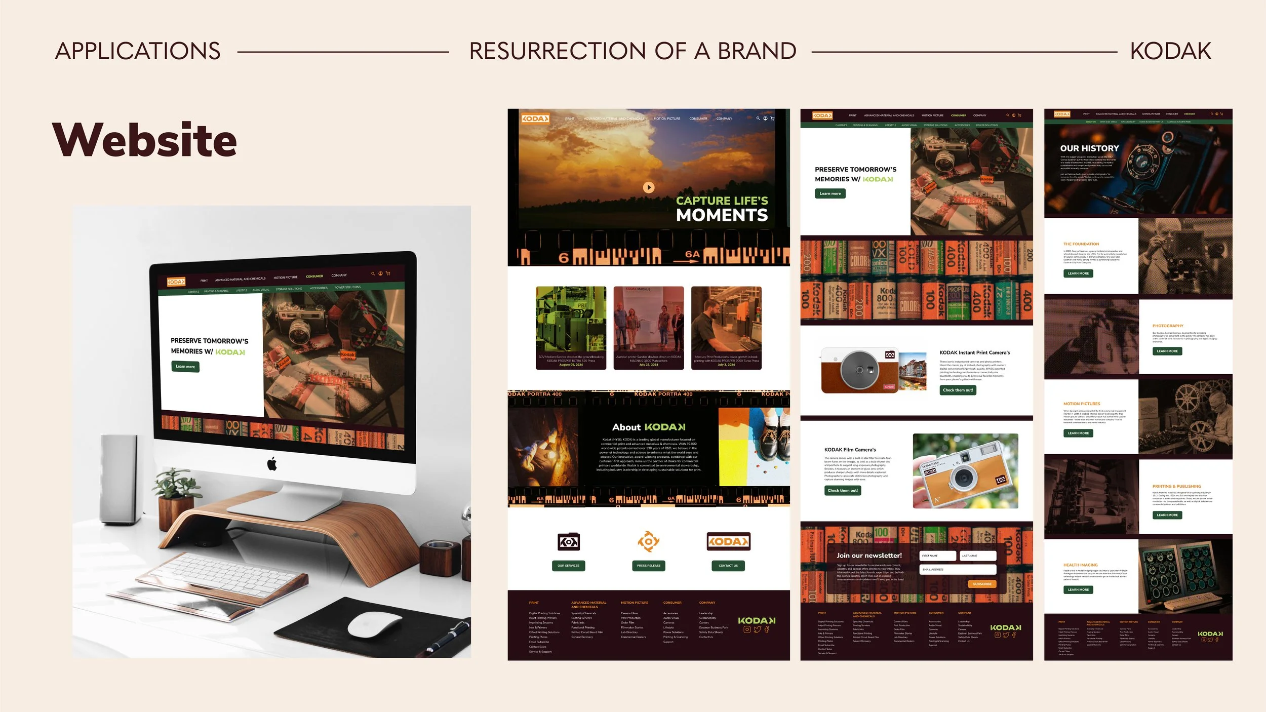
Resurrection of a brand
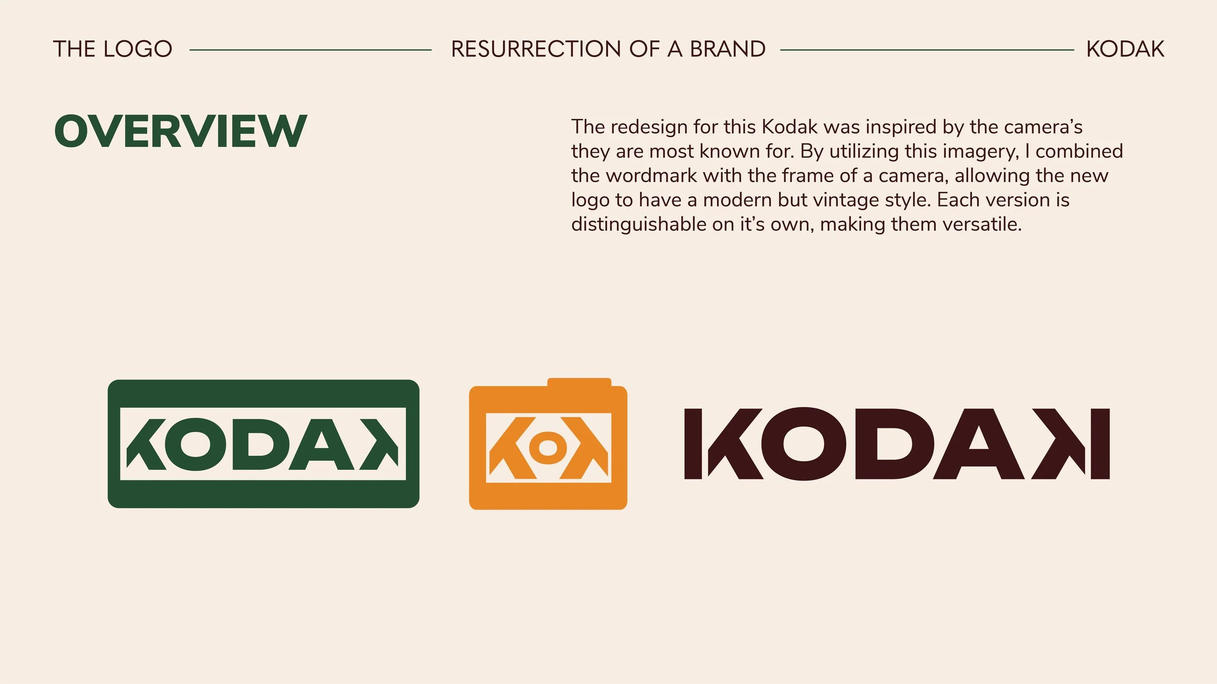
For this project, we were tasked with resurrecting a dead or declining brand. I chose to rebrand KODAK, the camera company. This rebrand guideline is a modern revival of Kodak’s iconic identity, blending its rich history with a fresh, contemporary design. Inspired by Kodak’s legacy in photography, the rebrand features a bold, geometric logo that integrates a camera frame, emphasizing both nostalgia and innovation.

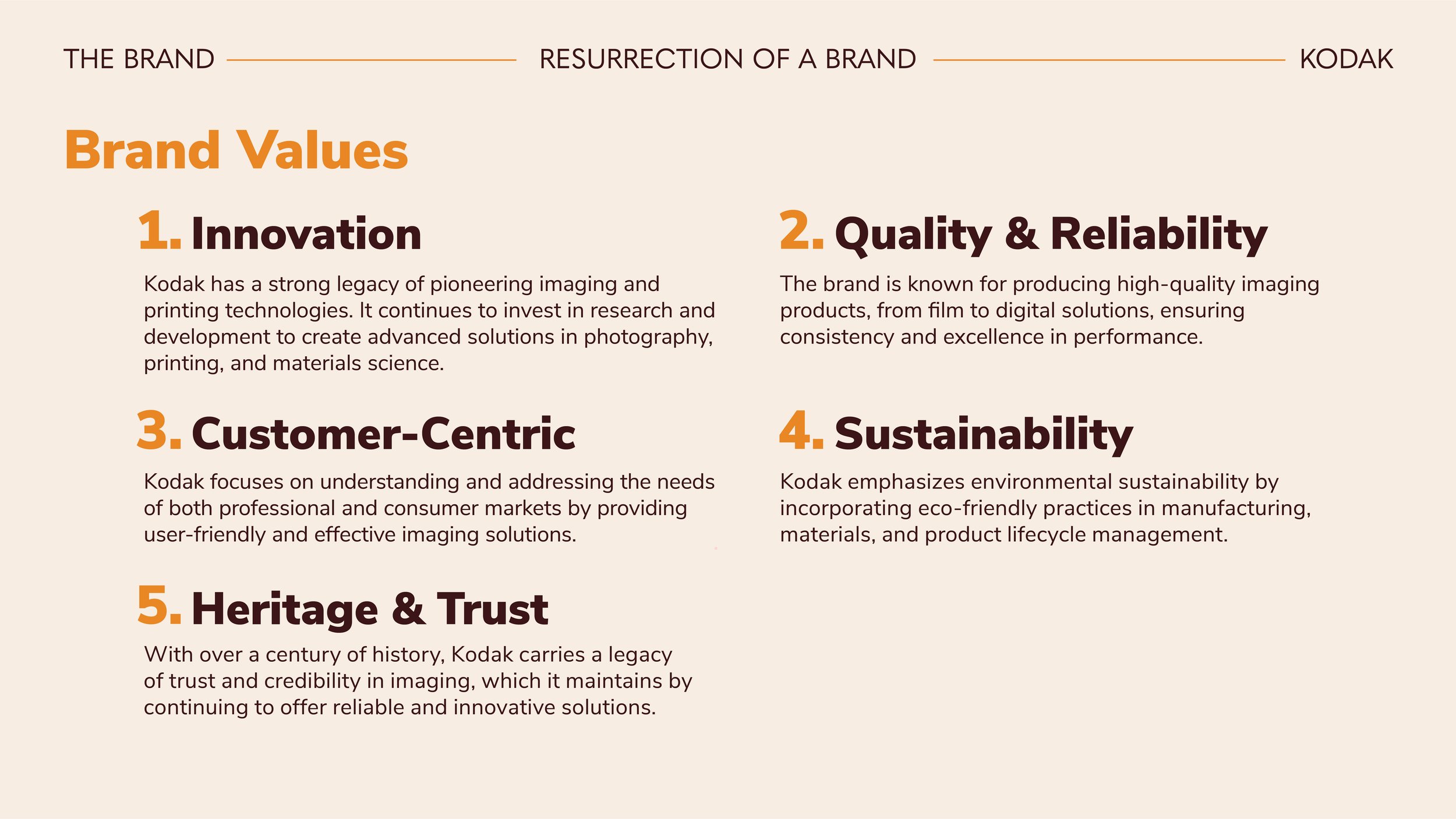
Key Elements
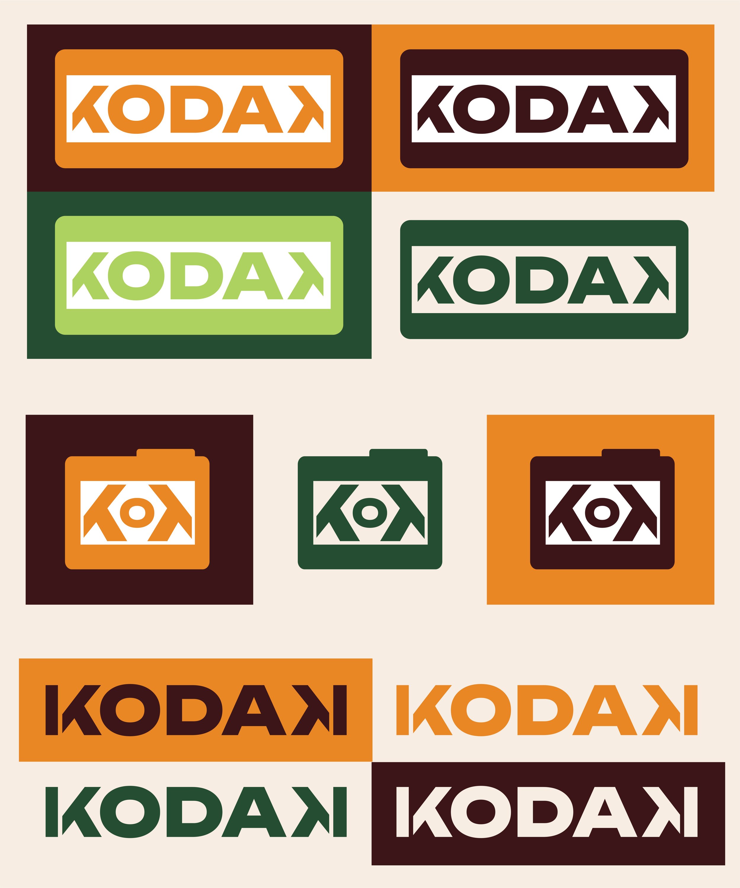
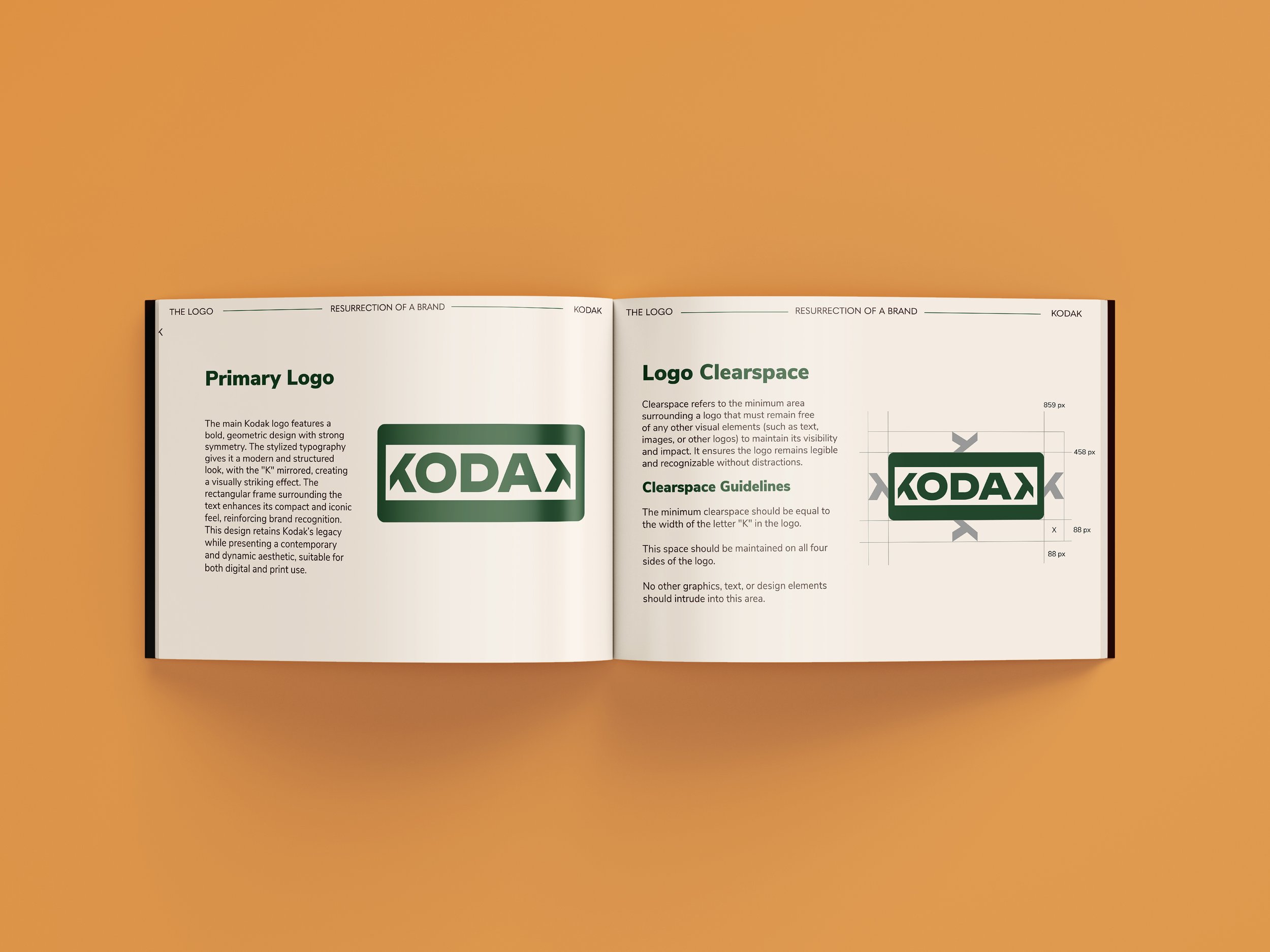
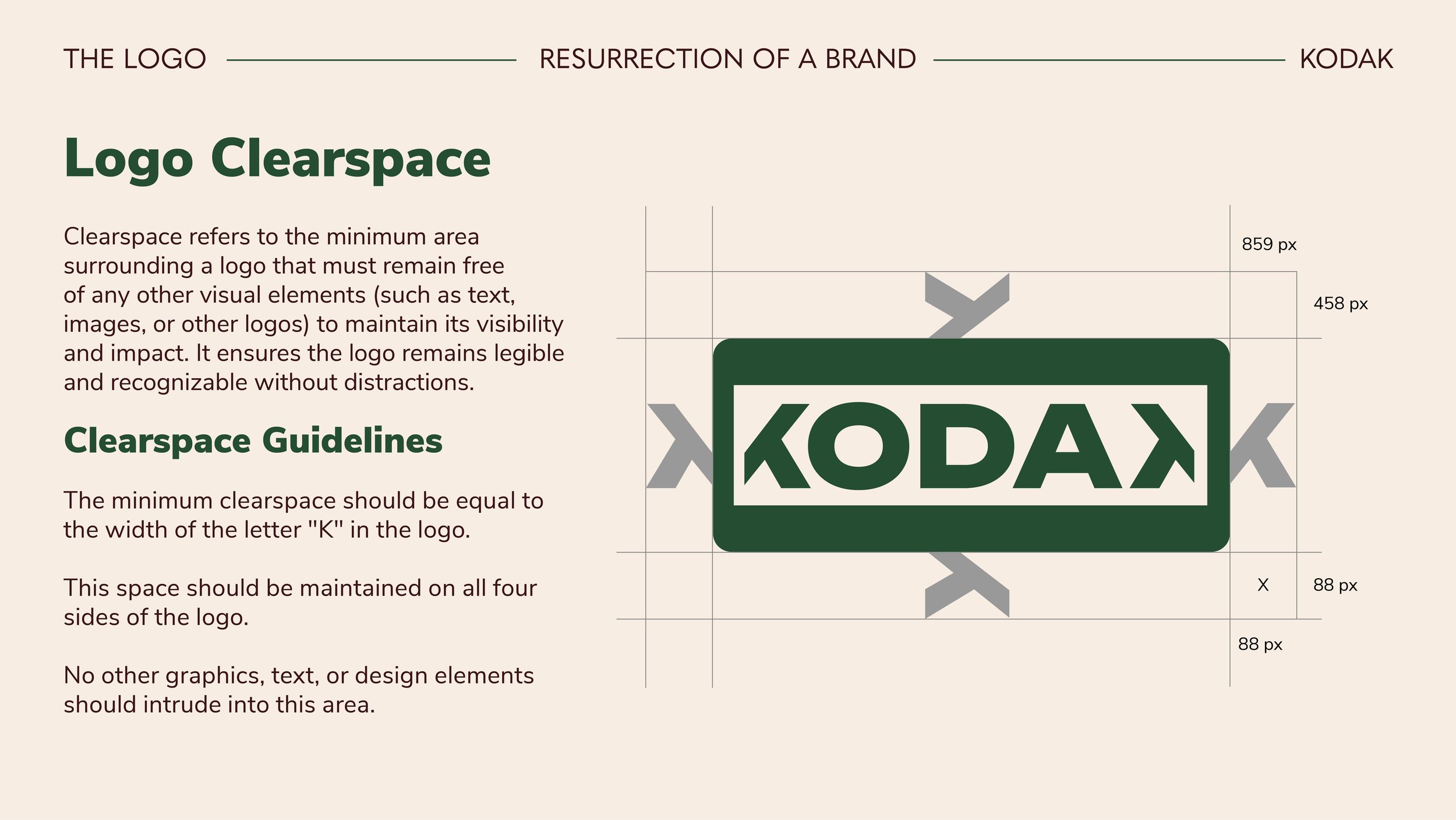
Logo Redesign: A striking, symmetrical wordmark with a mirrored “K” to create a dynamic and recognizable visual identity.
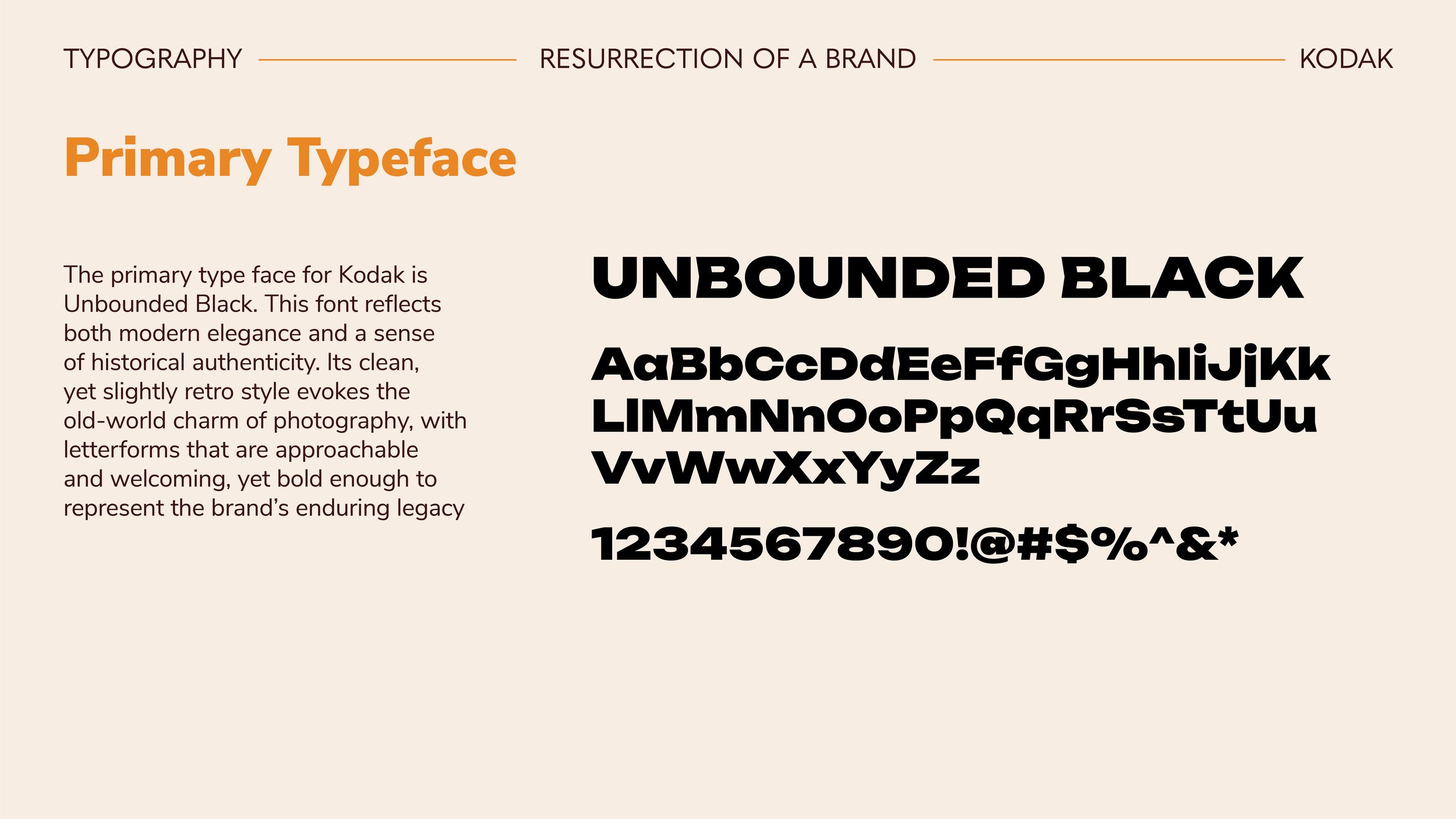
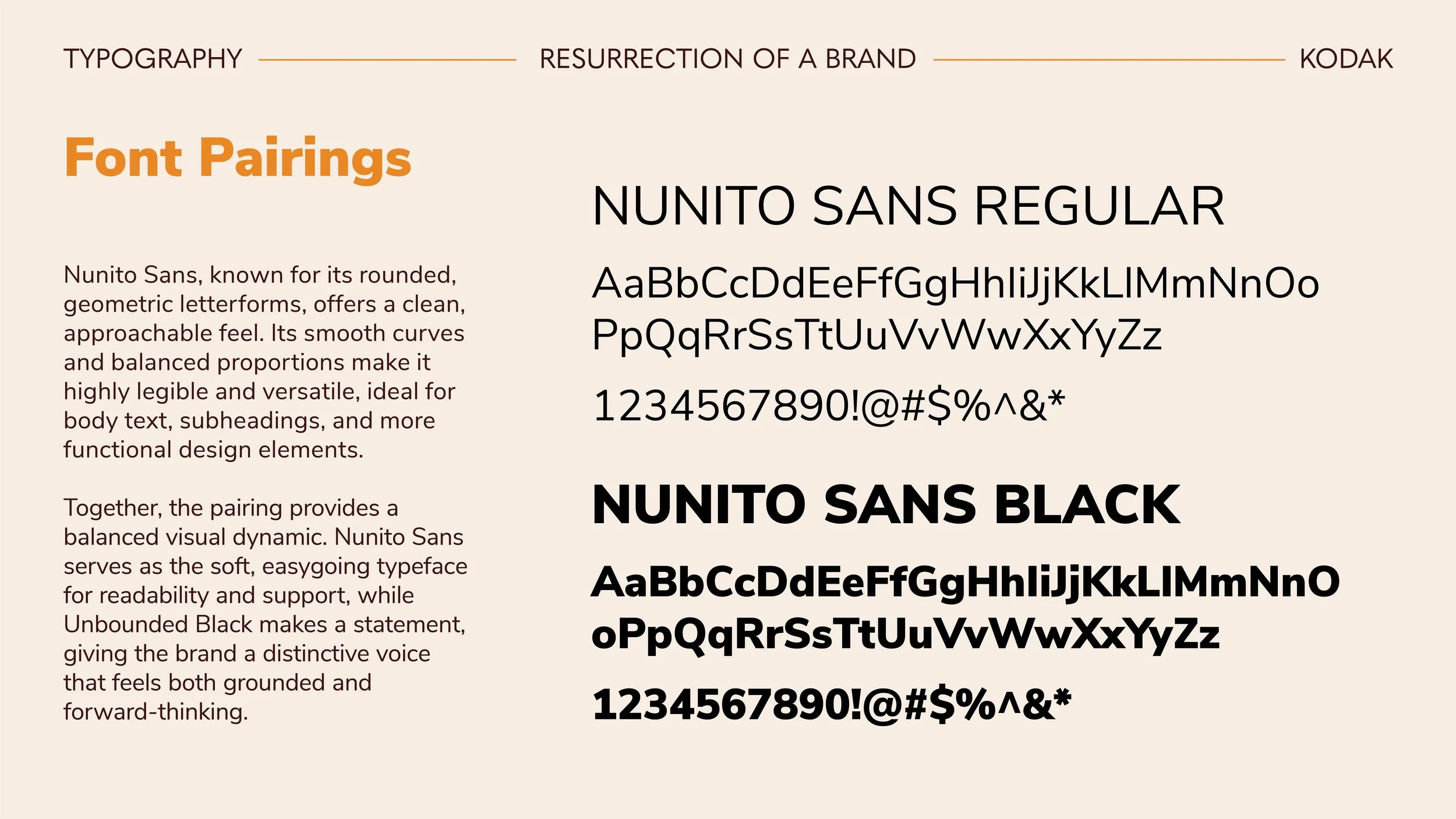
Typography & Color Palette: A blend of modern and vintage-inspired typefaces paired with a carefully curated color scheme that evokes both digital and film-era aesthetics.
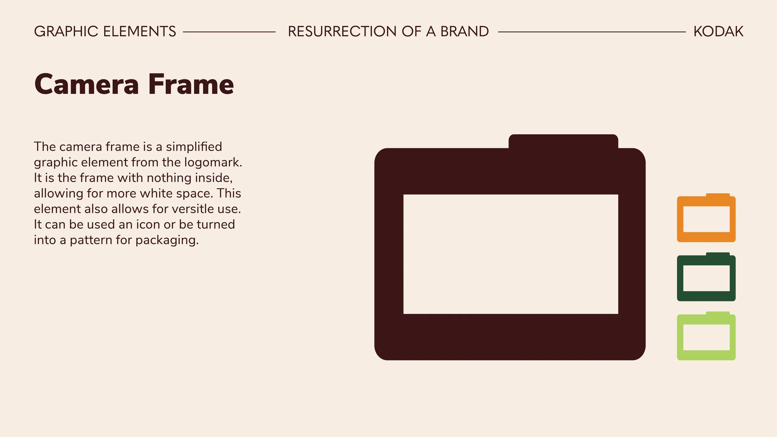
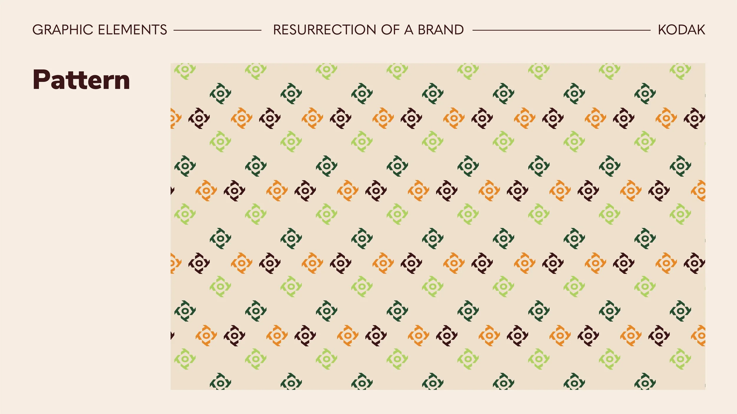
Graphic Elements: Custom camera-inspired motifs, including a lens and frame, reinforcing Kodak’s imaging heritage.
Brand Strategy: A refreshed vision, mission, and tagline usage to position Kodak as a leader in both traditional photography and emerging technologies.
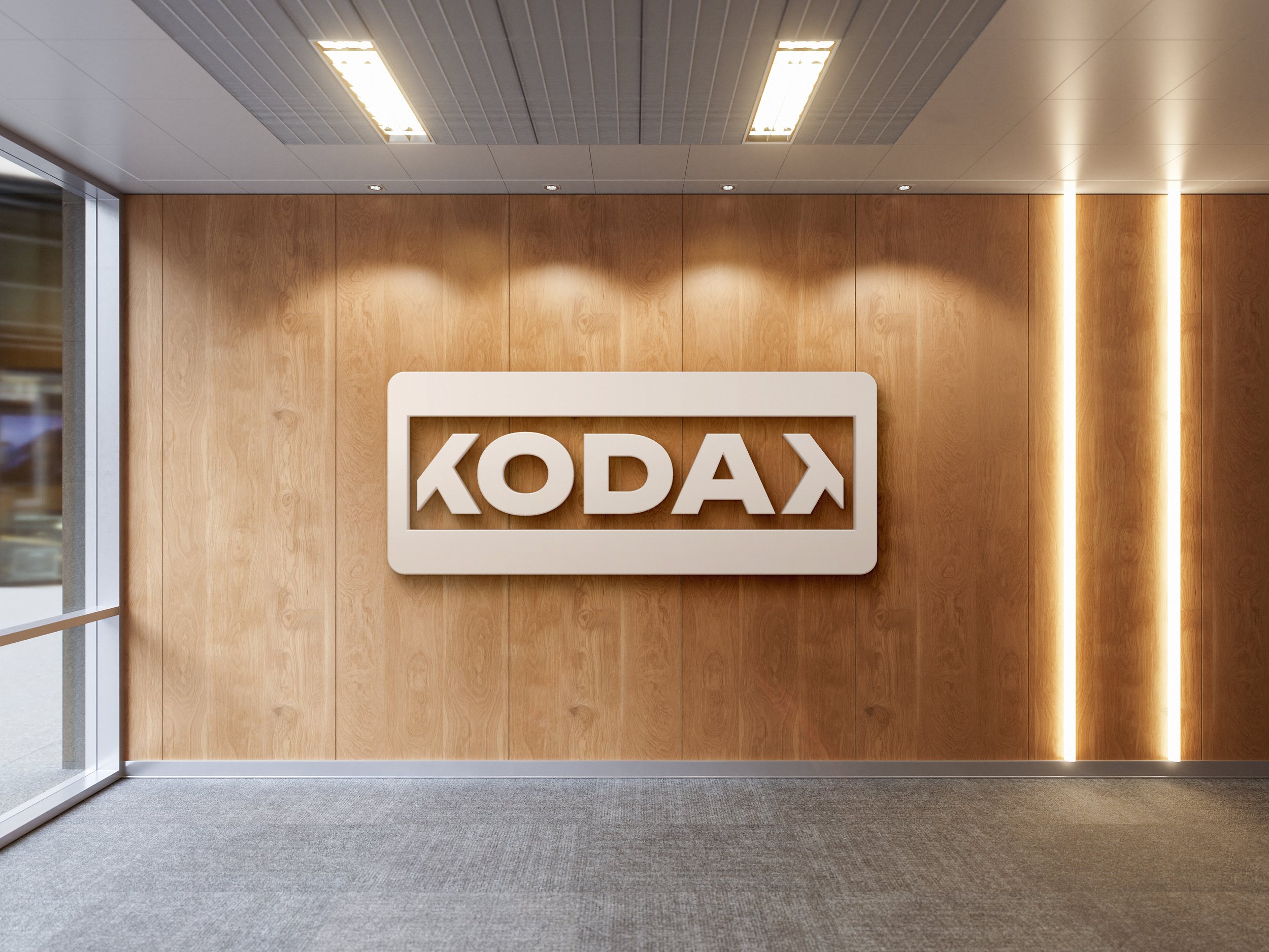
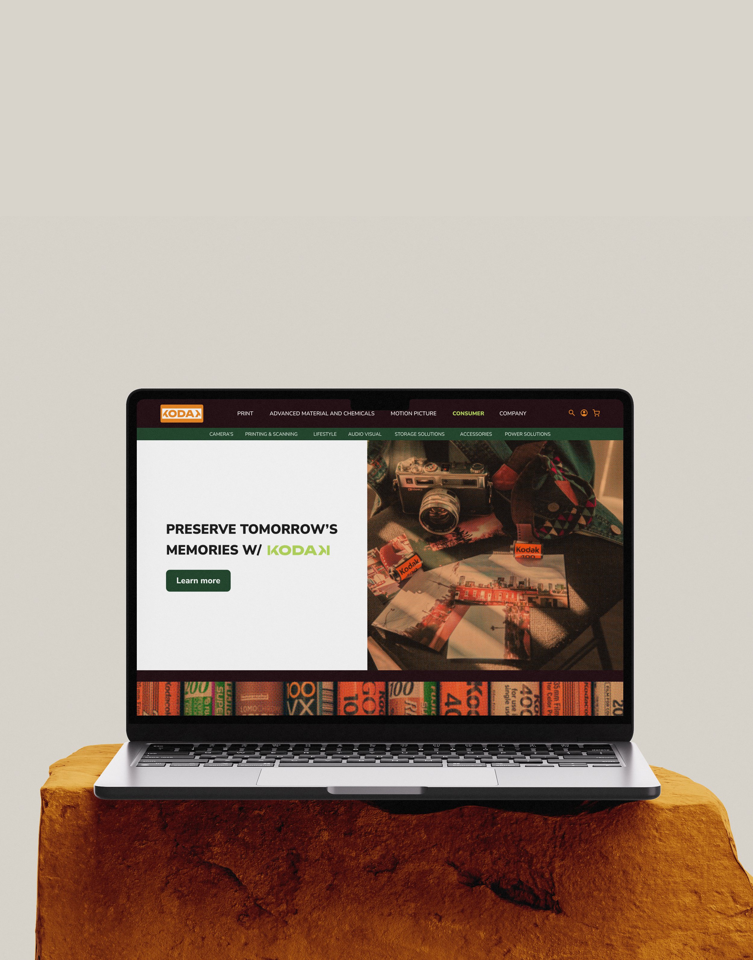
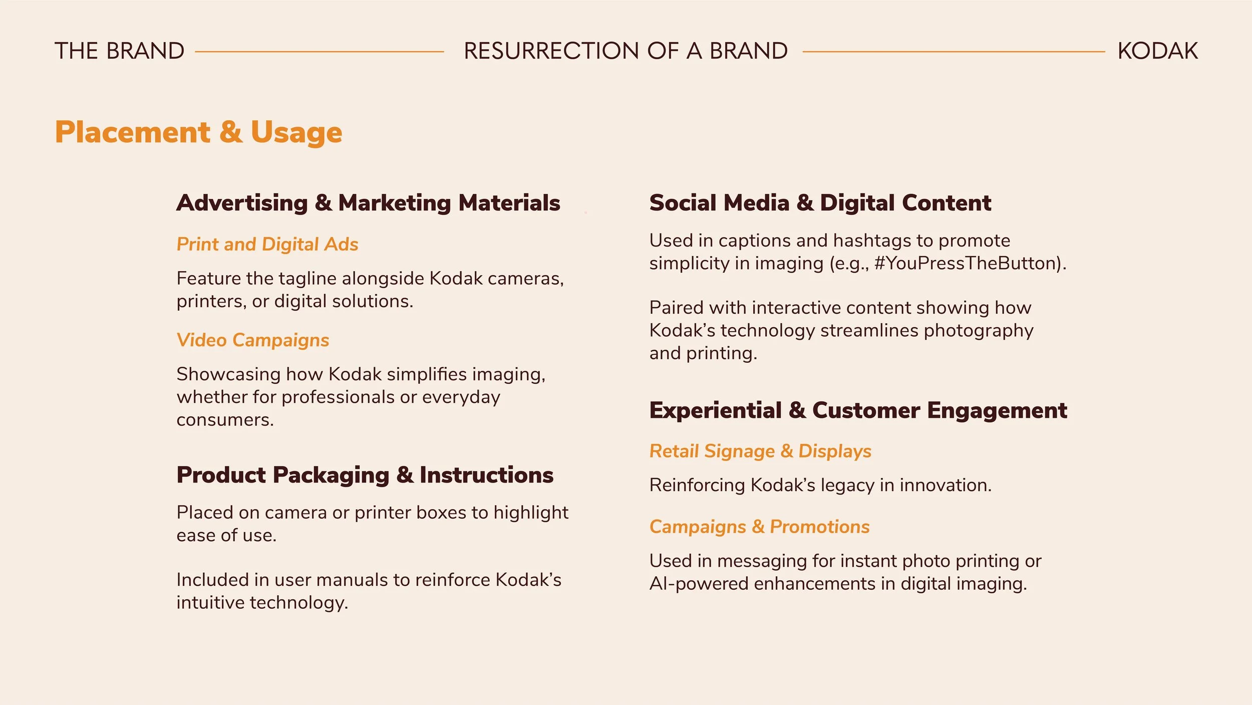
Application: Designed for digital and print, with mockups for packaging, website, and business collateral.