our
past
For this project, we were tasked with creating an illustration book. The concept for our book could be of any subject. I chose to illustrate a graphic novel using a story I had written. The story itself focuses on self-discovery, love, and acceptance. There are also elements from my own experience that help better portray the message of the story.
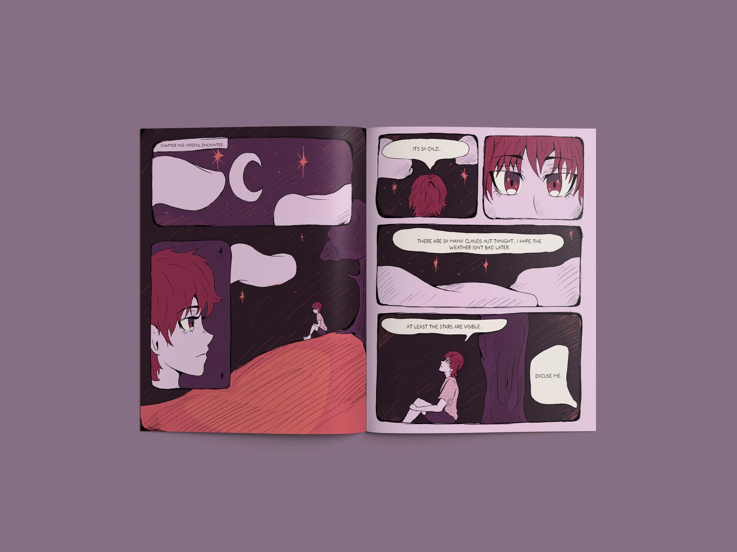
The story follows the character, Luna Solis, a girl who isolates herself from others and goes to an unoccupied field to help vent her thoughts alone. She is met by a mystery girl, Stella Rivers, and together they discuss everything but nothing at the same time. This is the first part of their story, “OUR PAST”.

My idea for this project was to incorporate my own story while also using a story I had written myself. Being part of the LGBTQ+ community, I wanted to explore the difficulties that come with acknowledging who you are while also coming to terms with how society sees people like us.
The story of these two characters are told in three parts; Our Past, Our Present, & Our Future.
Below is just a small snippet of what would eventually become a full graphic novel.
Concept idea
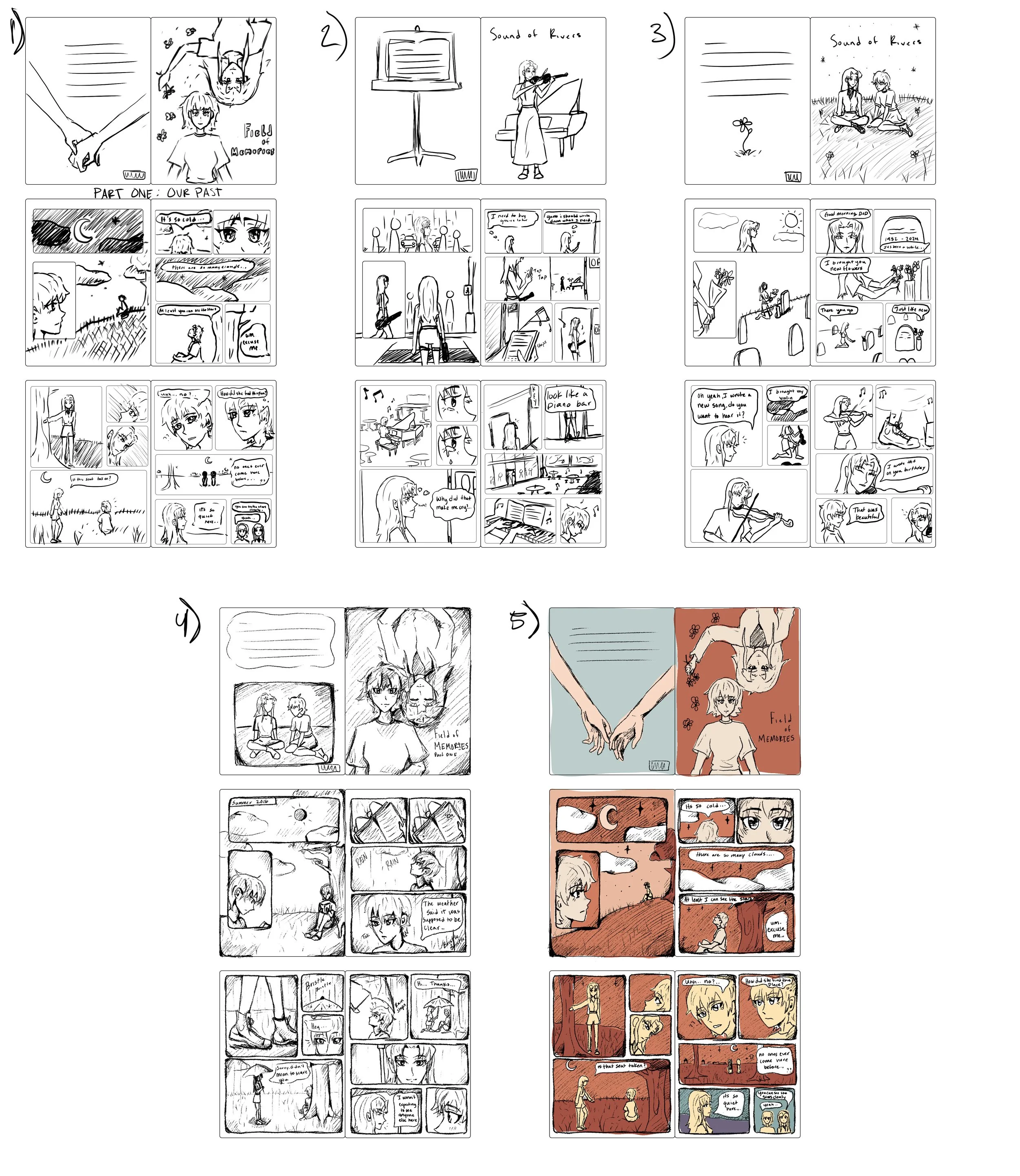
Progress


the characters
On the left, we have our main character, Luna Solis. The perspective for her design was to make her seem introverted but open enough for a stranger to approach her. I also wanted to keep the designs minimalistic, as to really focus on the story and the feeling it gives the reader. Her name is also symbolic in the sense that she resembles the moon with her characteristics. She is gentle, introspective, and creative.
On the right, we have our main lead, Stella Rivers. The idea for her was to create a character that had the same ideals as Luna but put into a different perspective due to how she was raised. Her name also has symbolic meaning, it means ‘star’ in latin and ‘rivers’ represents the fluidity of her character.
Together, they create a poetic earth-meets-sky pairing—water flowing under a starlit or sunlit sky. They represent two contrasting yet interconnected forces in the story.

cover draft #1
The cover showcased both characters lying in the field. The colors were representative of the lesbian flag, enforcing the overall message of the novel. However, the typography was not placed well and needed adjusting

cover draft #2
Moved around the title position. This was starting to turn out better, but I started to question the overall composition and color palette. I wanted to try something else and experiment more with a graphic novel style.

Final Cover
The title became more prevalent, and the overall composition improved, making the characters more dynamic and lively. The color change also allowed for my contrast and consistency. It still has the feminine characteristics without being muted.