
For this case study, we were tasked with researching and creating a condiment/beverage line associated with a country of our choice. I wanted to do something related to my heritage, so I chose Mexico as my country. I tied my ideas to the paper decorations that are typically seen during celebrations while also using my skills in simple illustrations.

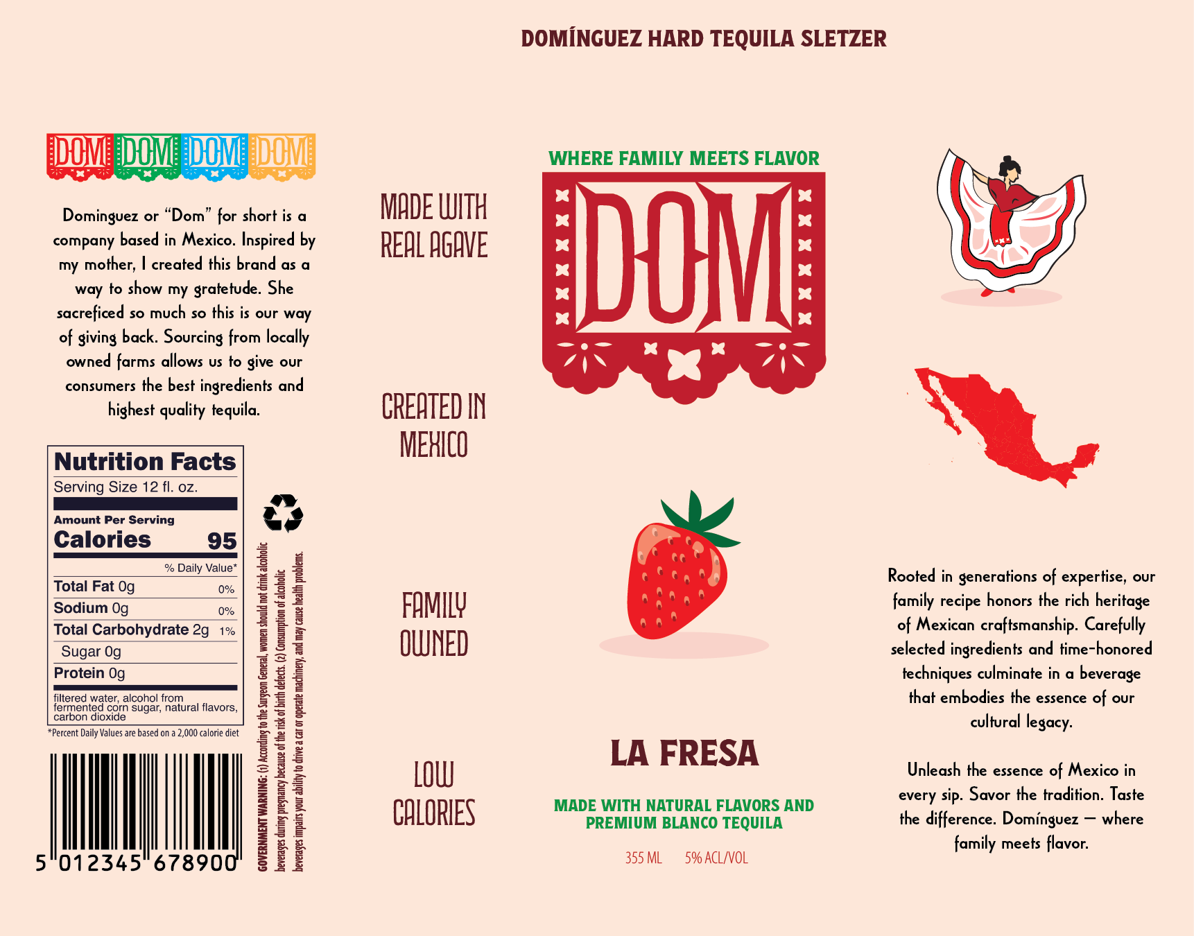
For my logo and designs, I used two different ideas and combined them. Pulling from the illustration of the dancing woman and the papel picado, I created a logo that resembles my Mexican culture while also providing a minimal and sleek design.
I wanted to focus on the story of the brand while also portraying the simplicity of the design. The meaning of the name ‘DOM’ is told on the can, giving the users a glimpse into the company itself while also allowing reliability with the consumers.
Concept idea

Progress


Rough draft #1
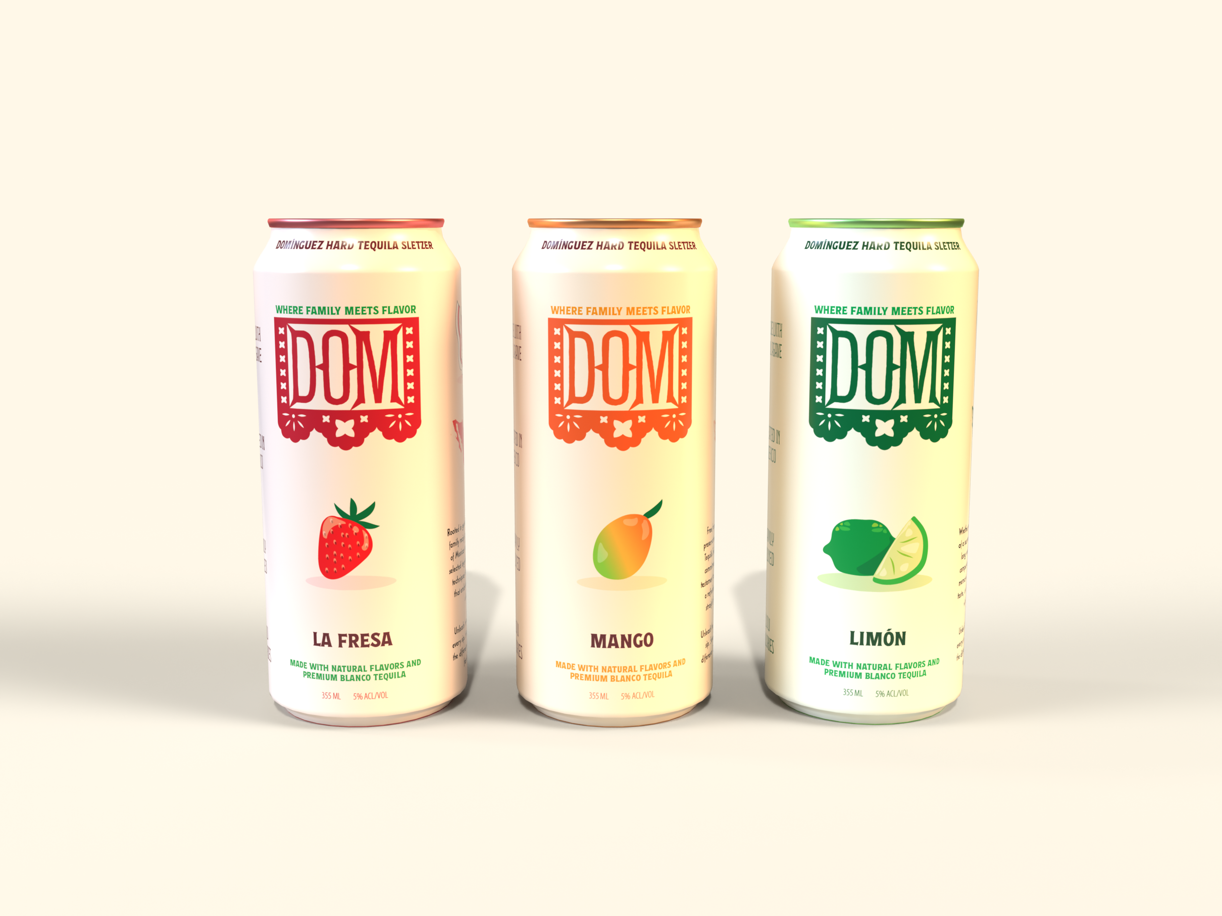
At first, all the cans focused on the color of the associated flavor, making them distinguishable. This worked and allowed the consumer to tell the difference more easily. However, the colors were draining the actual logos and graphic elements. This is when I decided to reduce the tint and move around some elements.


final draft
I adjusted the tints and changed some of the typography in order for the overall label not to seem as busy and give more space for the elements to breathe. These tiny changes created a new perspective and allowed incoming consumers to readily view information more easily.


